Start with the financial picture
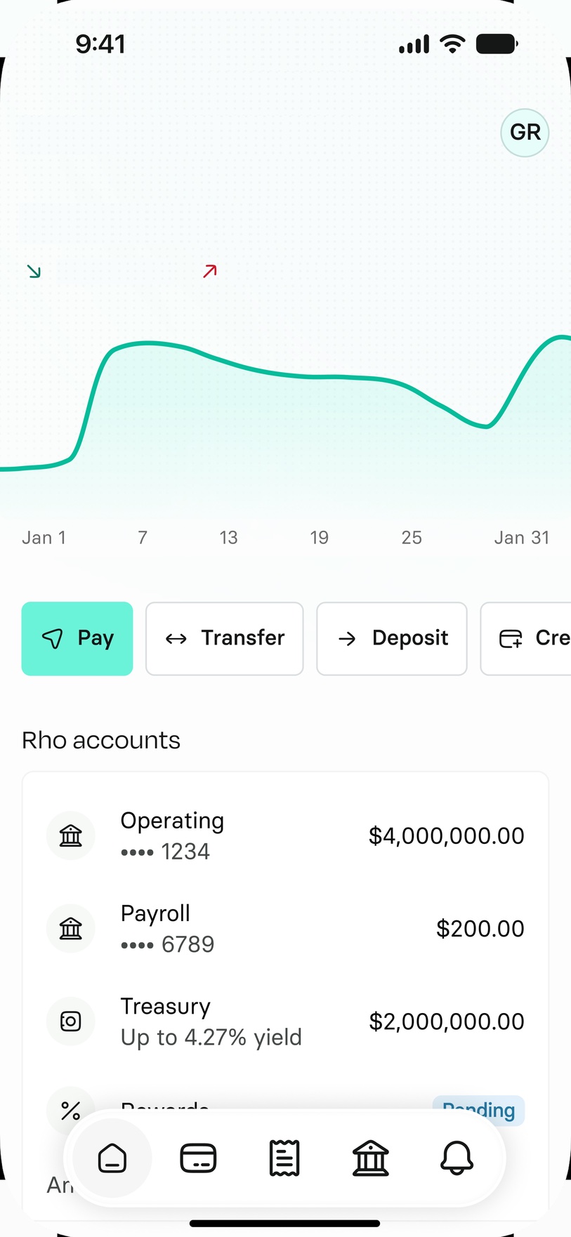
Put balances, trends, and account health first so users can understand where they stand at a glance.
You'll find the password included in my CV.
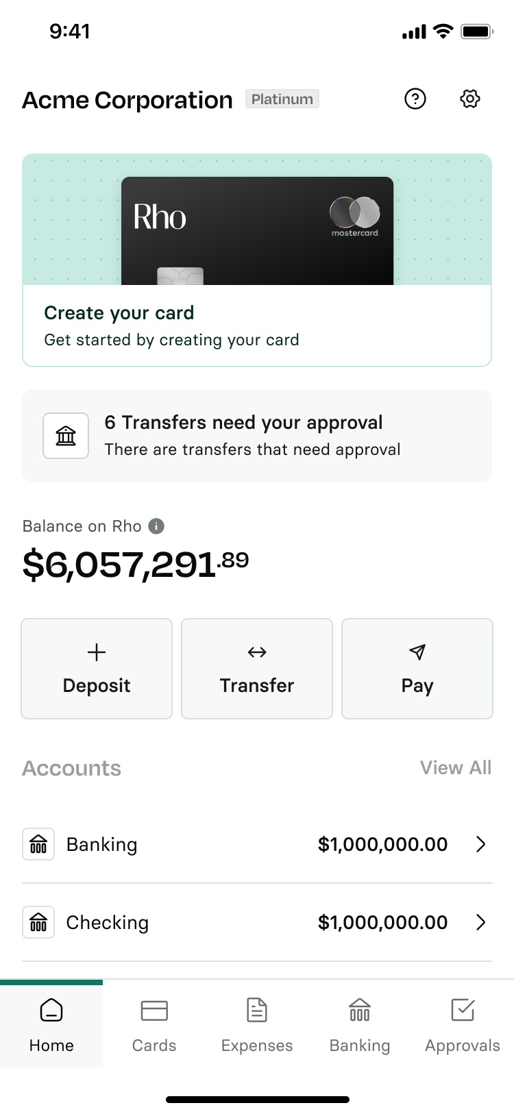
Over time, Rho’s mobile Home became the place for everything, from balances and card spend to setup tasks and product updates, all given the same weight. Reorganized the app around what matters most: the financial picture first, quick actions and the tasks that need attention close at hand, and a clearer way to move between products and businesses.
What's included
Over time, Home became the place for everything: balances, tasks, card spend, quick actions, accounts, and product updates.



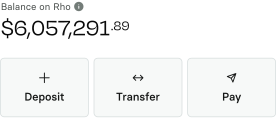
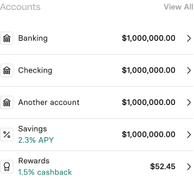
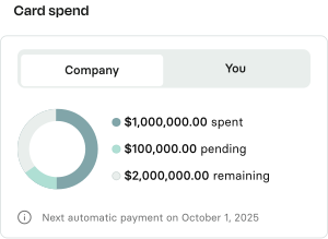
Onboarding lived above core financial information.
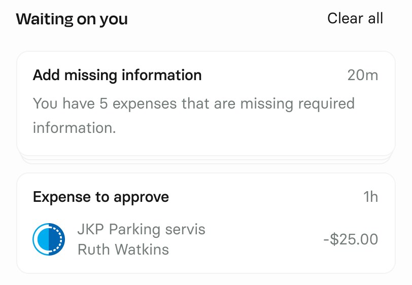
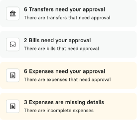
Every task lived at the top of Home, with no way to clear what wasn’t relevant, making the list easy to tune out.
Core financial information appeared only after tasks, instead of leading the Home experience.
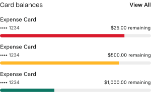
Each card appeared with the same weight, regardless of which one actually needed a decision.
Instead of giving every product and task equal weight, I reorganized Home around the information and actions users need most often.
Put balances, trends, and account health first so users can understand where they stand at a glance.
Make common money movement actions immediately accessible without letting them dominate the experience.

A clearer hierarchy puts the financial picture first, keeps common actions close, and lets detail unfold naturally as users move through Home.
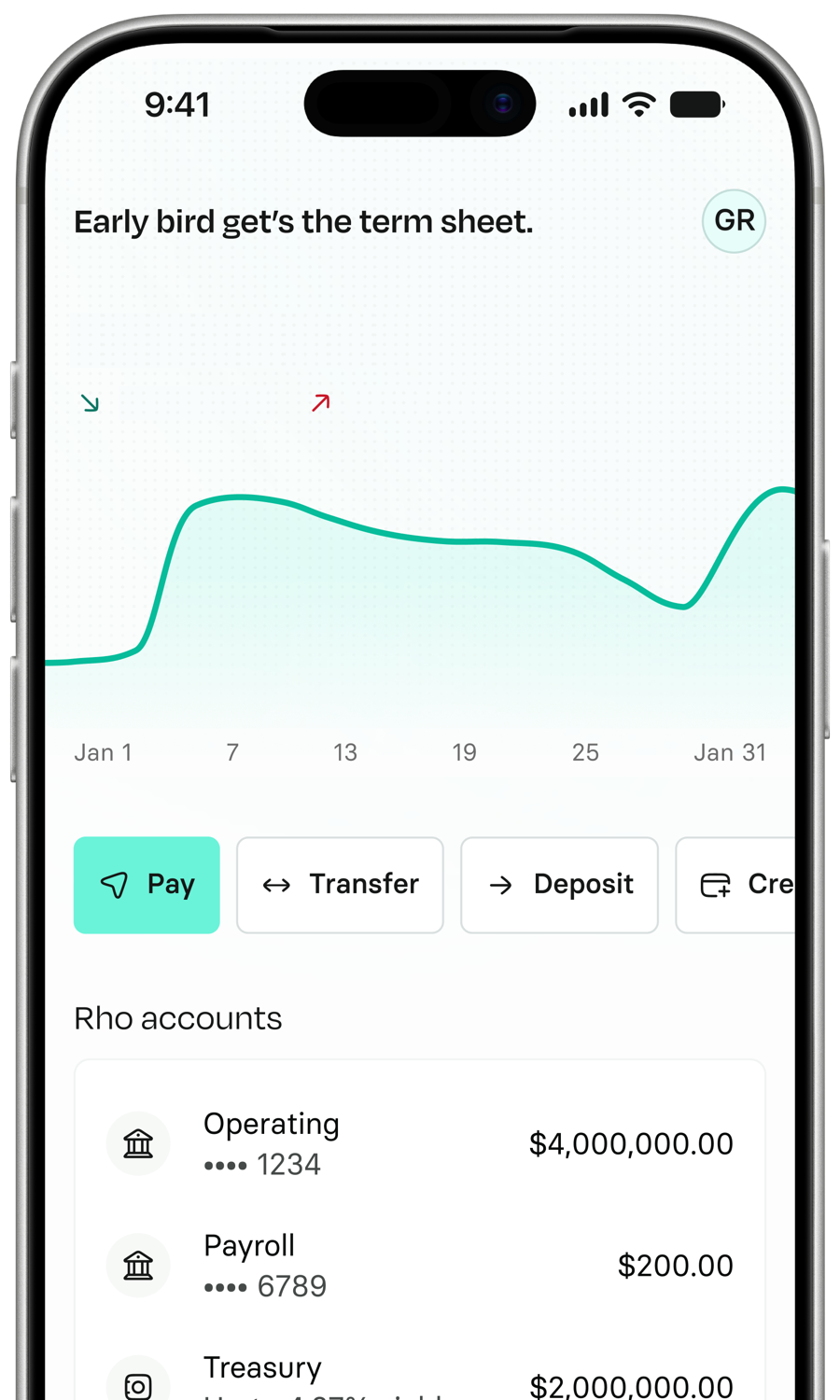
Put balances, trends, and account health first so users can understand where they stand at a glance.
 Operating•••• 1234$4,000,000.00Payroll•••• 6789$200.00
 TreasuryUp to 4.27% yield$2,000,000.00
 Rewards1.5% cashback$0.00
See your accounts and balances in one place, with the details that matter close at hand.
 Ruth Watkins$20,000.00
Track inflows and outflows to understand how your money is moving.


 $48,000.00
See credit spend, available balance, and usage without leaving Home.
 Uber PendingJan 15, 2026-$25.00
 Indigo HotelJan 13, 2026-$150.89
 AmtrakJan 12, 2026$8.17
 Kwik TripJan 12, 2026-$62.65Nori SushiJan 10, 2026-$40.22
Recent activity makes changes in the financial picture tangible.
Updated cards, controls, and iconography create a cleaner, more cohesive Home experience.
 New
Old
New
Old
As Rho expanded across more products and workflows, we needed a clearer way for users to move through the app and find what they need.
Account context and key utilities stay accessible without competing with the page.


Dynamic messages bring a lighter moment to Home without getting in the way.

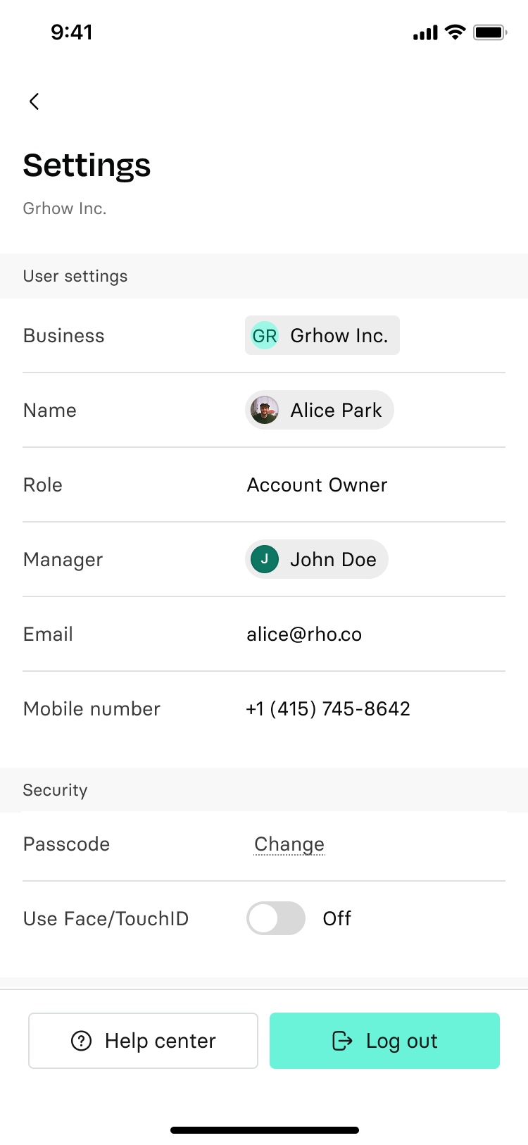
Moving the business switcher into the top bar made it easier to access while following a familiar mobile navigation pattern.
Grhow Inc.Account owner
The new navigation adapts to how people use Rho: across roles, platforms, preferences, and movement through the app.
Rho previously had no in-product notification center. We introduced Notifications as a primary destination, keeping important updates within reach throughout the app.
The same navigation adapts to the platform, motion preferences, and how users choose to interact with it.
The navigation adapts to each platform’s system conventions instead of forcing the same treatment everywhere.
Keep the collapsed navigation where it feels most natural.
The same navigation, with motion adapted to the user’s preference.
Important updates lived primarily in email. Rho had no dedicated place to see what needed attention or what had changed.
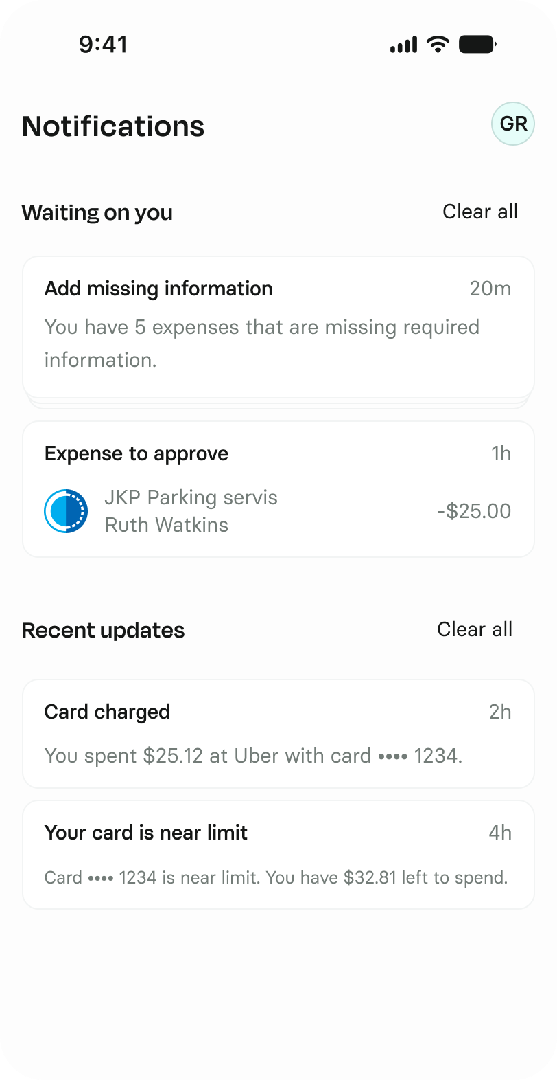
A new system for surfacing what needs attention and what’s changed.
Important updates previously competed with everything else on Home. Giving notifications their own destination made them easier to find without adding more noise to the main experience.
Notifications are separated by whether they require something from the user or simply keep them informed.
Requires your attention.
Keeps you informed.
Each notification is defined by the same five attributes, creating a model that could scale across products and use cases.
| Notification | Product | Audience | Origin | Priority | Trigger |
|---|---|---|---|---|---|
| Expense incomplete | Expenses | Personal | System | Waiting on you | End of day |
| Expense awaiting approval | Expenses | Team | System | Waiting on you | When submitted |
| Card fraud detected | Cards | Personal | System | Waiting on you | Immediately |
| Verify ownership structure | Compliance | Team | Request | Waiting on you | When requested |
| Card transaction | Cards | Personal | System | Recent updates | Immediately |
| Transfer complete | Banking | Personal | System | Recent updates | On completion |
| New team member | Users | Team | System | Recent updates | When invited |
Actionable notifications open the exact item that needs attention, so users can act without finding it again in the product.
 Monday, July 5
9:41
Monday, July 5
9:41
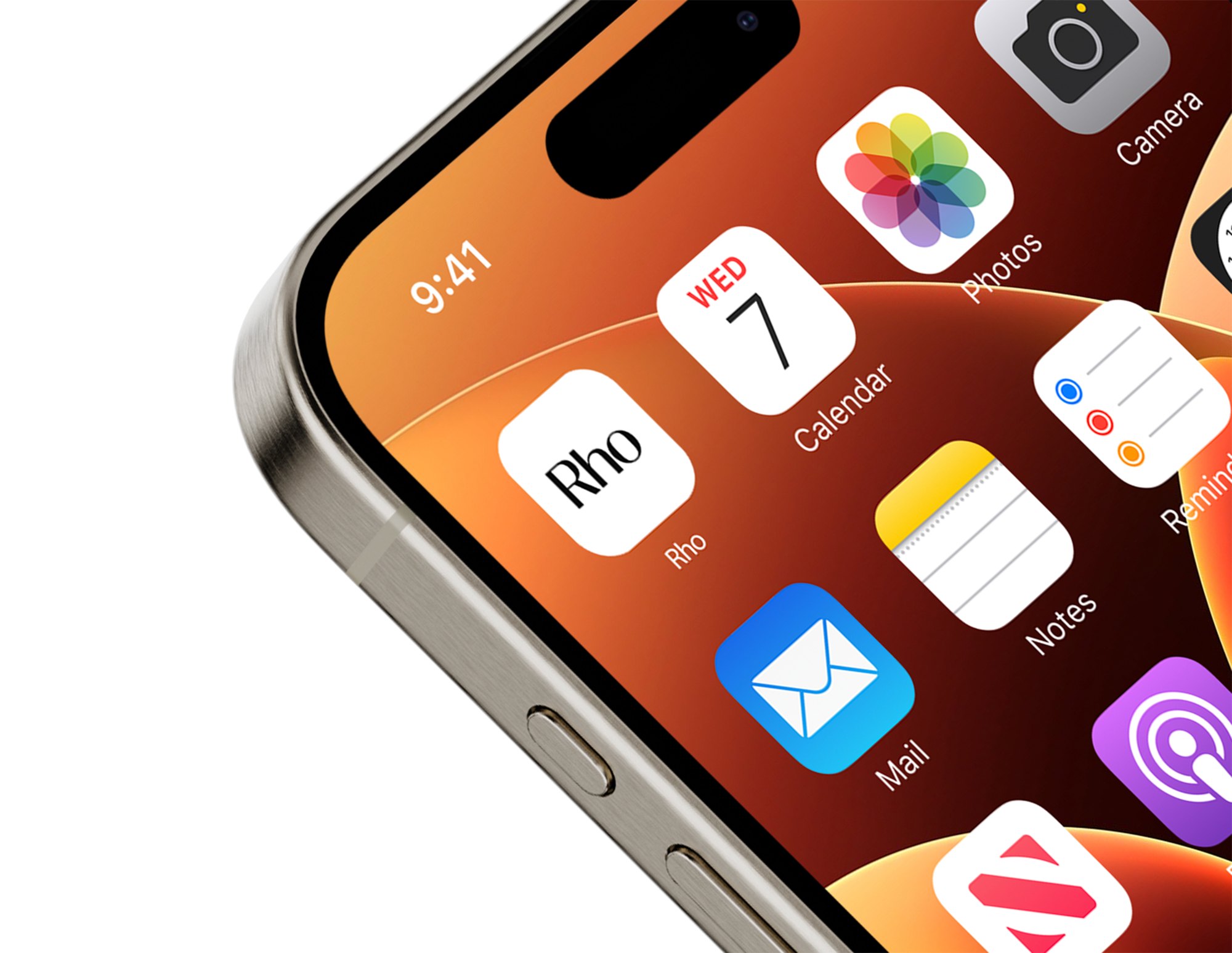
 Rhonow
See what needs attention before opening Rho.

The notification carries the destination with it, so there’s no hunting for the item once the app is up.
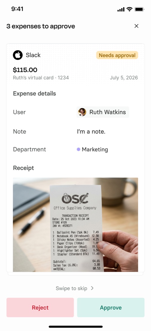
Rho lands on the exact expense that needs attention, ready to act on.
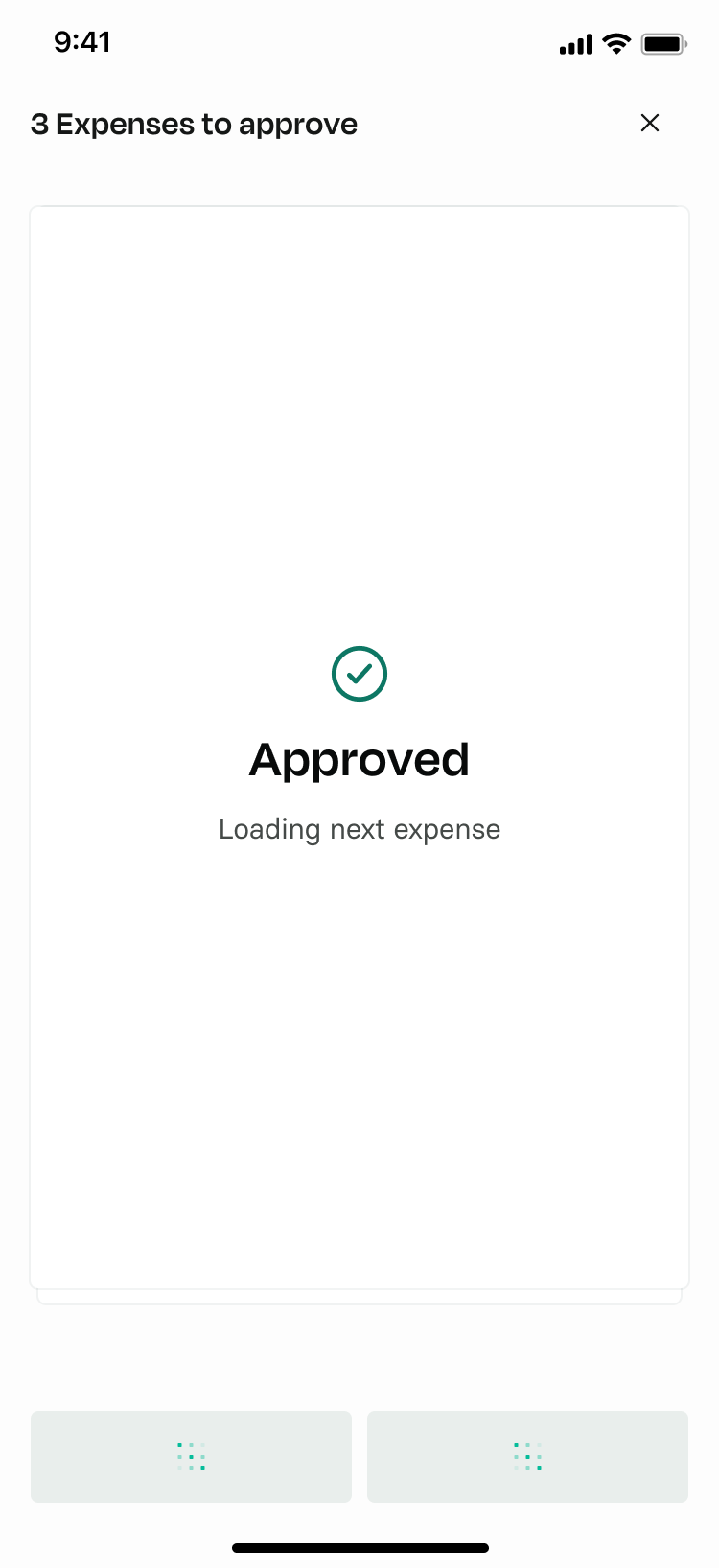
Approve, then continue straight to the next item in the queue.
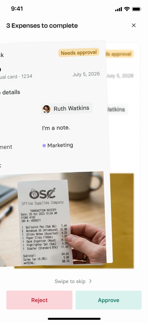
Swipe an expense aside and the next one moves up, without losing the place in the queue.
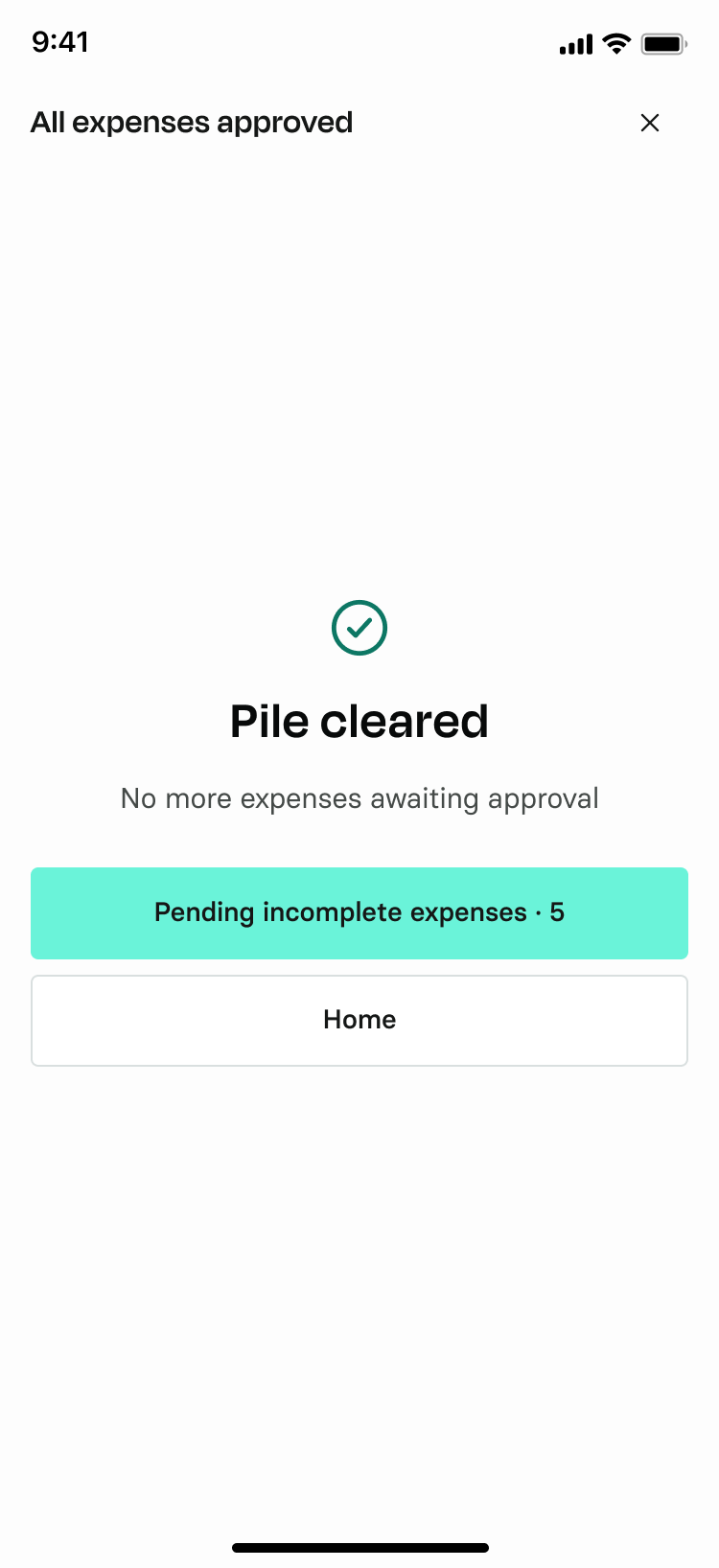
When nothing is left waiting, Rho says so, and points to whatever still needs completing.
Instead of asking Home to surface everything, the redesigned experience gives each part of the product a clearer role, helping users understand their finances, recognize what needs attention, and move directly into the right workflow.
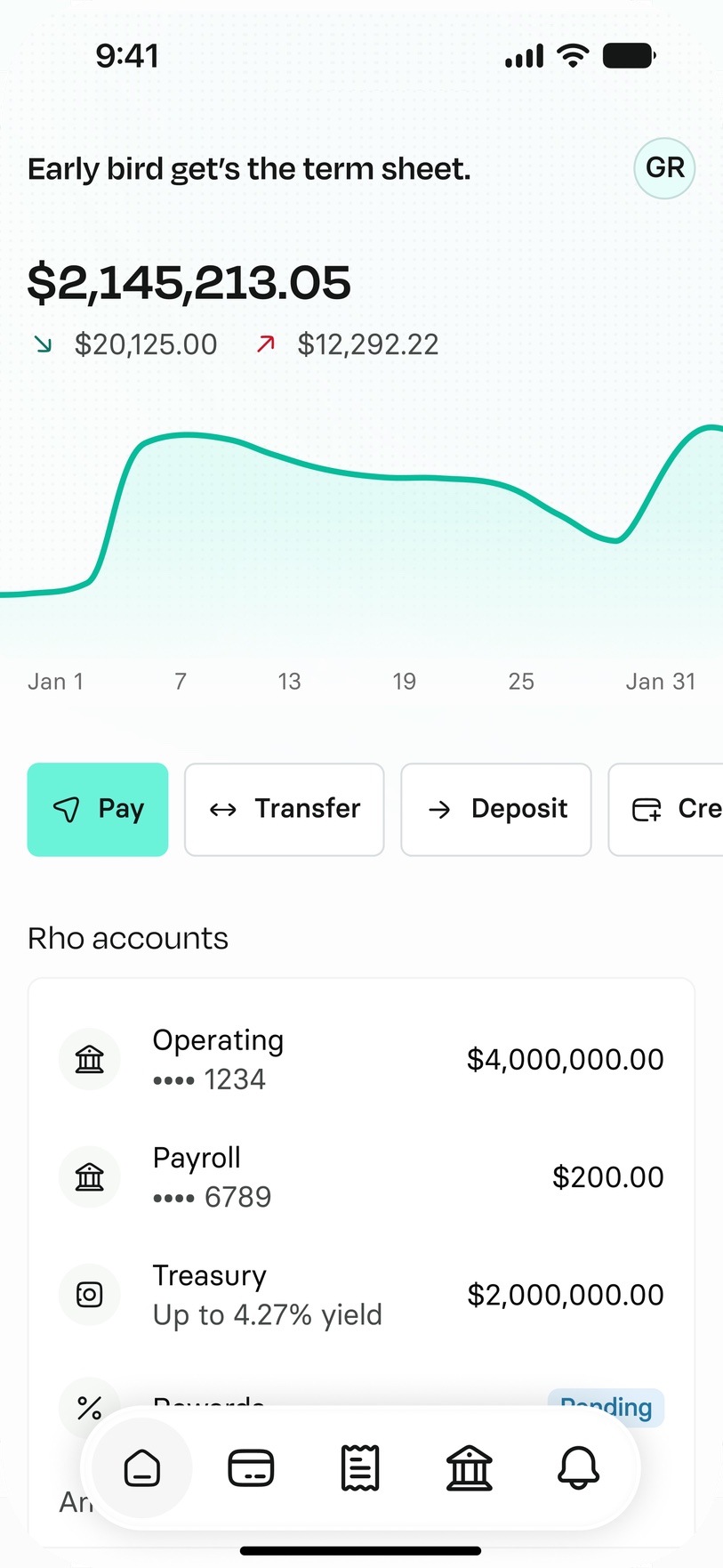
Home is now centered around understanding your financial picture rather than competing with notifications and tasks.
Notifications have a dedicated home, separating important updates from the core financial overview.
Actionable notifications lead into focused experiences designed around the specific task the user needs to complete.